Missed the explainer video?
Watch the Being Secure, Fast and Readable explainer and get a head start in your knowledge before completing this text element!
Module Text
Missed the explainer video?
Watch the Being Secure, Fast and Readable explainer and get a head start in your knowledge before completing this text element!
In Module 1 we looked at SEO Scams and Cons so you can avoid the companies that could cause your website considerable harm.
Module 2 covered personalized search so you don't make the very common mistake made by many website owners and think you have good rankings when you don't!
In Module 3 we saw how Search Engines go about deciding who should be in their Search Results Pages and in what order they should rank.
Module 4 was all about deciding what you want to rank for in the SERPs so you don't waste your time trying to compete with much larger players or ranking for phrases no one searches!
Module 5 outlined how we can help search engines understand the basic structure of our website.
In Module 6 we went through how to check if the key elements of a web page are optimized.
In Module 7 we got to grips with how to audit and optimize our code to ensure it is correctly marked up for search engine bots to read and understand clearly.
Module 8 was all about structuring the overall content of your website so search engines can understand your topic areas.
So far we have been working on ensuring your content is easy for search engine robots to find and easy to understand so your pages are relevant.
But Search Engines also consider how easy it is for users to get at your content when deciding where you should rank.
'Great results' doesn't just mean great content, it means web pages that load fast, are easy to read on any device (desktop, tablet or laptop) and deliver their content securely.
What does that all mean. Lets dive in!

Our first step is to make sure your website looks good in all screen sizes. Here are the steps using Google Chrome Developer Tools:
If your page falls to pieces at this point or it becomes very difficult to read your website is not responsive. Responsive websites are able to adjust how they display content depending on the device a person is using.
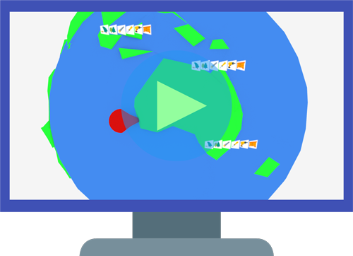
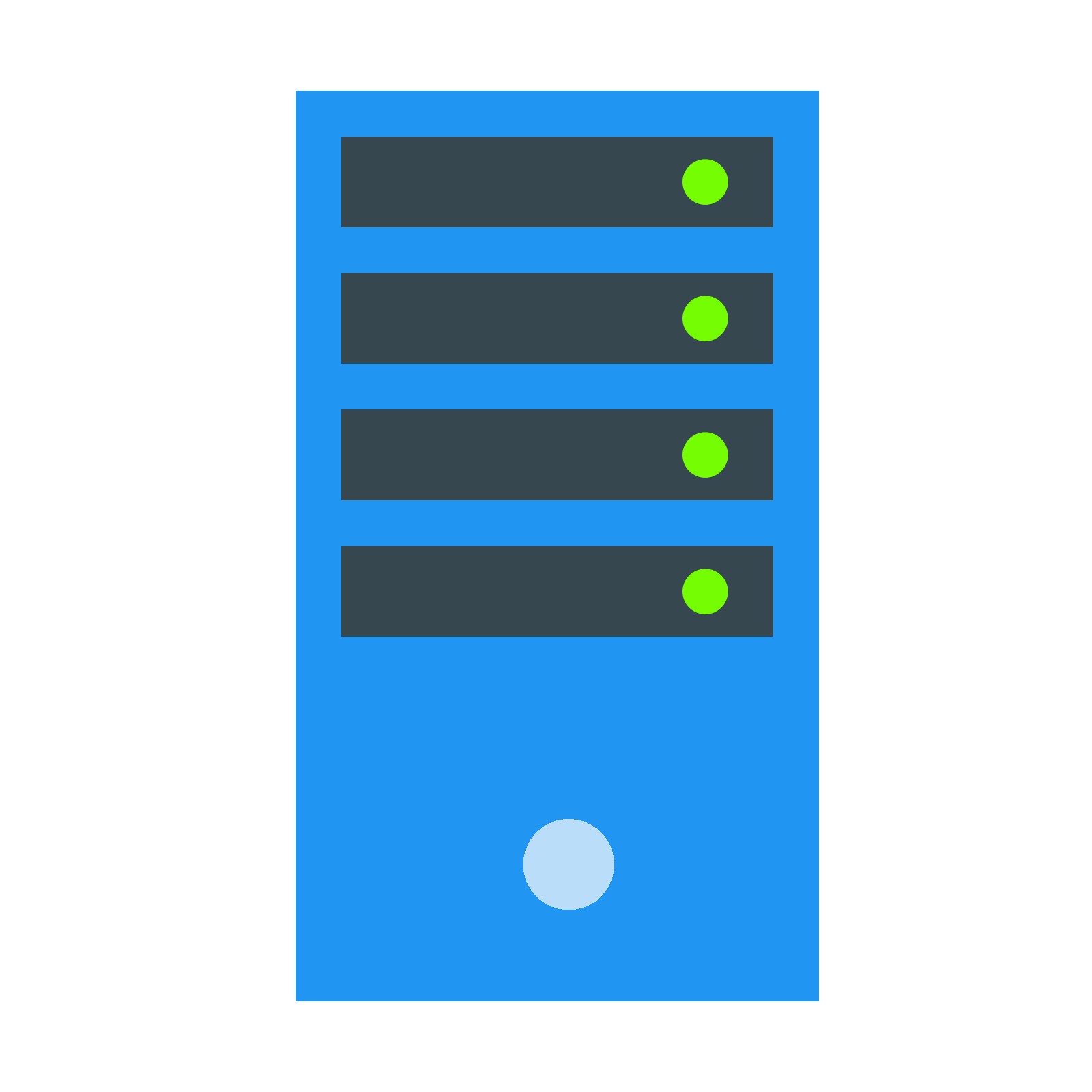
There are dozens of factors that search engines consider when deciding how well your content is presented. Click the icons on the image below to learn about the most critical ones.
Click on each hand pointer to explore the image below
There are many more. We've already taken care of a fair few in the course so far, such as implementing title tags and meta descriptions. But where to find the full list of what needs to be done?
Luckily Google provides a free tool so you can test any page on your website for dozens of factors alongside advice on how to resolve issues.
This tool is Google Lighthouse. There is a link below in Info & Resources which will take you to the Lighthouse page that has a tutorial on how to set up and run audits.
Google Lighthouse simulates the experience of a person accessing your web page via a smartphone on a slow connection. Your rankings will be affected by what it finds compared to your competitors.
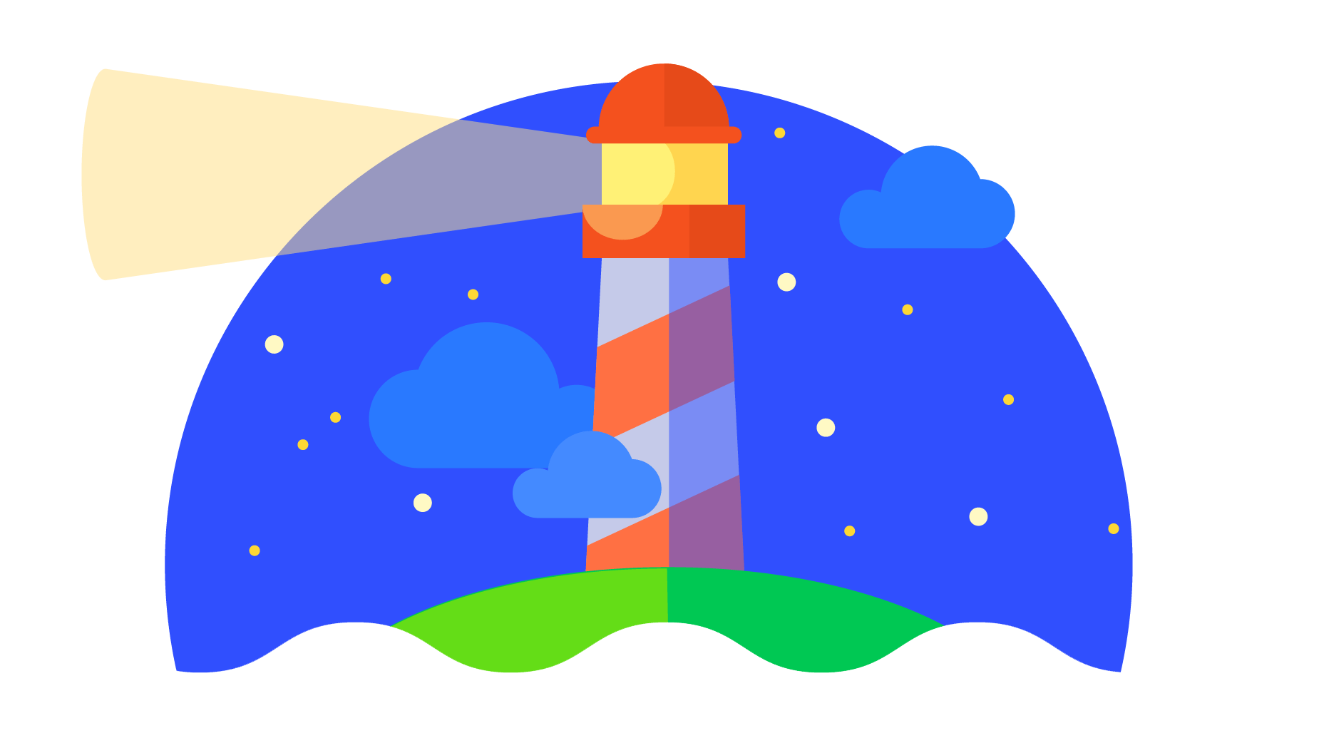
Google Lighthouse audits are broken down into 5 areas. Click the icons on the images below to learn more
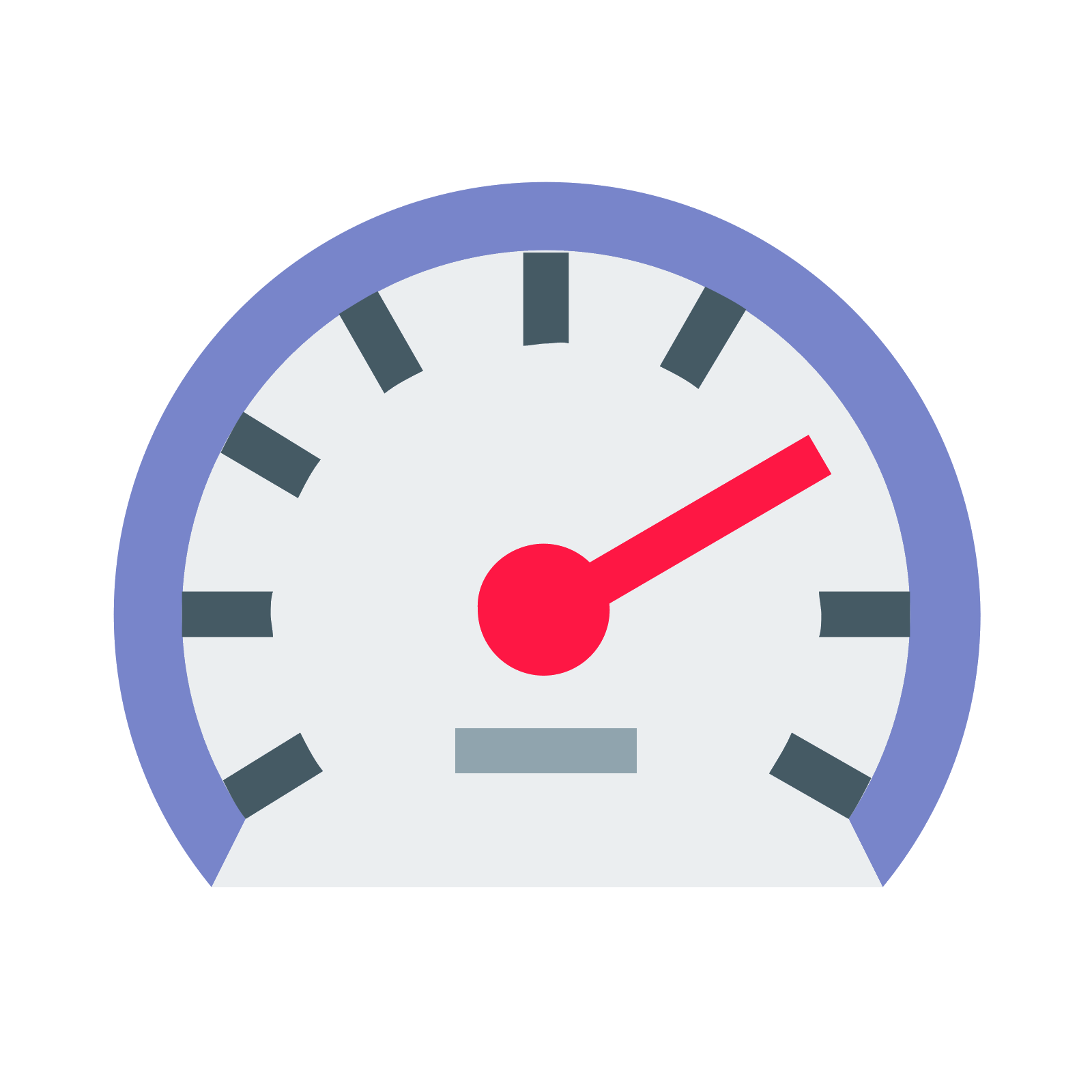
This should be one of your key focus areas. Its all about how fast your page loads and what is slowing it down.
More for apps than websites and beyond the scope of this basic course but worth exploring if you are technically minded and looking to promote an app.
Another key area, especially when it comes to checking for security issues on your page or in the way your page is delivered.

What issues does your website have for people with disabilities or impairments? This is a large sector of internet users so ignore them at your peril!
Well of course! We've covered the most critical parts of this audit already but that doesn't mean you will score 100%. This is only a Basic Course after all!
Much of what the Google Lighthouse audit throws up requires technical and programing knowledge and so are beyond the scope of this basic course. However if you employ a SEO agency or contractor this is a great place to check their progress over time and question various aspects of what they are doing.
If you have implemented what you have learned so far you will have passed most of the fundamental elements in the audit.
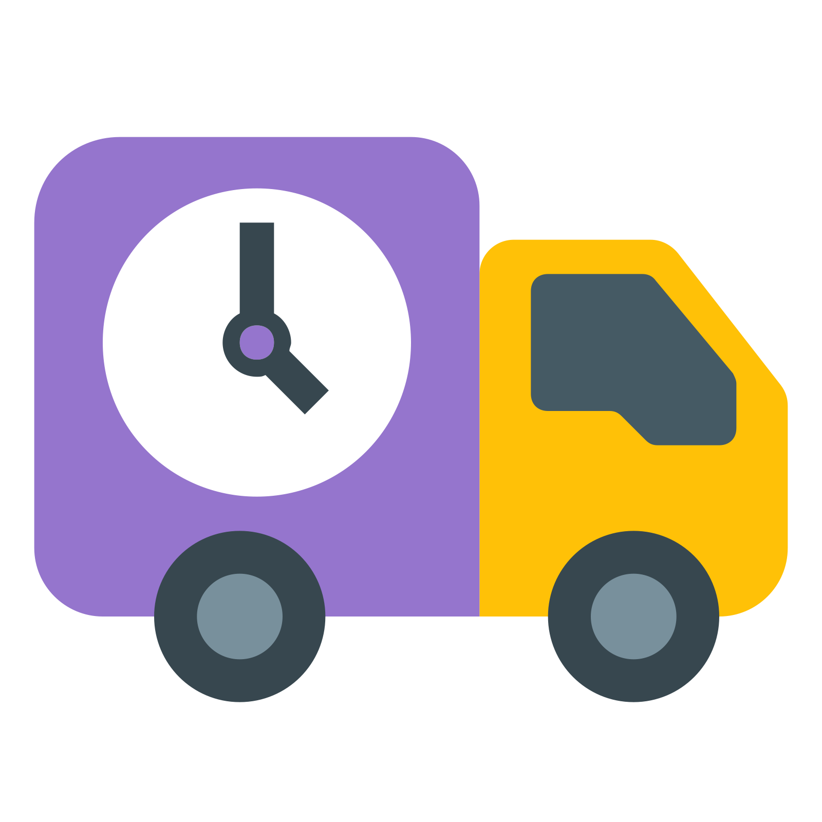
We'll focus on 3 further key areas where you can make a difference - Your security, hosting provider and images.

Search engines are going to give you more brownie points if you deliver your pages with a valid SSL using https in your url. It helps protect user privacy and security and search engines like to be associated with that sort of thing rather than websites that like to get up to no good.
You can check your website on this page to see if all is well. Remember just because your url starts https does not mean it is secure.
If your site fails the above test your hosting company can often help you set up an SSL so try them first if you are not technically minded.
So much of how fast your page loads comes down to the quality of the server it is hosted on so this should be your first check.
These are all technical terms beyond this course but there are plenty of resources around the net to read up on them if you want to find out more.
Right now all we need to know is that if your host cannot resolve these issues, move to a host that can.
There are links to hosting providers that can provide all the above at the bottom of this page.

Many webmasters rip images with file sizes of 1MB or more straight from their phone or camera onto their site. With a strong WiFi connection page loading seems fine but for mobile users these large images can grind your site to a halt.
Photoshop is one of the best tools for image optimization and it is no longer the heavy investment it once was. You can rent Photoshop for a few dollars a month these days via Adobe's Creative Cloud programme and there are plenty of online tutorials that will show you how to use the app to dramatically reduce the file sizes of your images.
You'll find links to Photoshop and tutorials at the bottom of this page.
Now lets talk Lazy Loading. When your web page opens everything that is visible before any scrolling down takes place is known as above the fold. Above the fold is obviously very different depending on the screen size but it's not actually an issue.
Jquery Lazy Load is a coding technique which means any image which is not above the fold (and the script works this out based on the screen size) does not load until the user scrolls down towards it.
By delaying the loading of these images you can achieve massive improvements in page loading times, especially if you have a lot of images below the fold.
Many standard platforms like WordPress offer plugins so no technical expertise is required. However if your website is bespoke build you will need the help of a programmer.
Content Delivery Networks can be a game changer when it comes to improving page loading times.
CDNs store parts of your website (such as images) on a network of servers around the globe. When an internet user opens a page on your site the CDN sends the content from a server located close to the user dramatically reducing the time it takes the user's browser to load content.
With many CDNs offering basic packages for free you can try before you buy and measure the improvements via Google Lighthouse.
There are links to the most popular and effective Content Delivery Networks at the bottom of this page.
Has this module highlighted issues with your website or SEO work but you don't know how to resolve them?
Now click the orange button to test your knowledge
Fully featured secure and fast hosting companies
Adobe Photoshop (for image optimization)
Content Delivery Networks (CDNs)
Lazy Loading Images